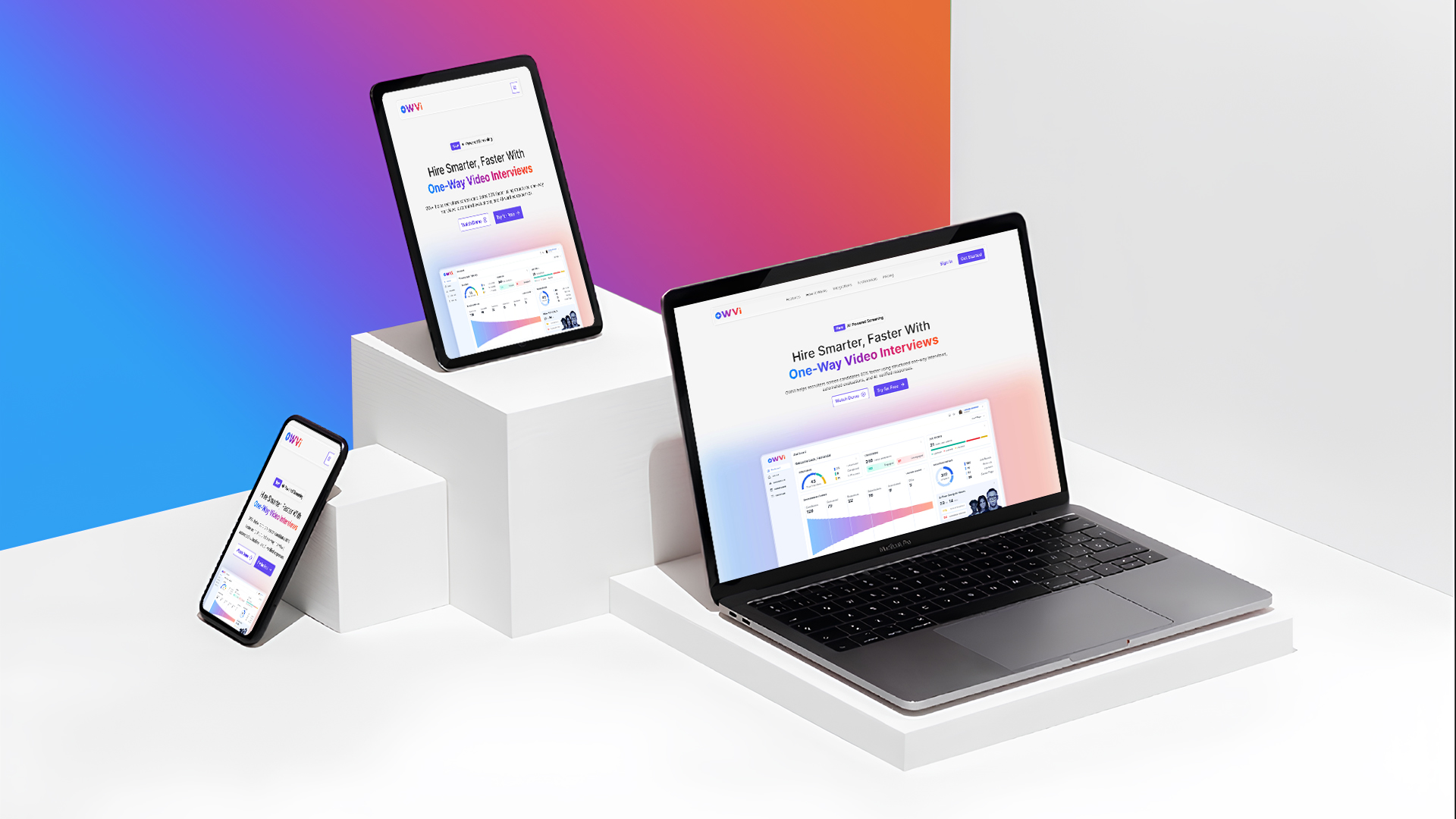

OWVI is a one-way video interview platform that helps hiring teams screen candidates faster and more efficiently.
Project Overview
Description
This project focused on designing a responsive landing page for OWVI, a one-way video interview platform aimed at simplifying early-stage hiring. The objective was to clearly communicate the product’s value proposition, establish a strong content hierarchy, and guide users toward key actions across desktop, tablet, and mobile devices.
The design emphasizes clarity, scalability, and visual consistency, ensuring the experience remains intuitive and engaging across all screen sizes. By aligning UX decisions with business goals, the landing page supports outcomes such as improved product understanding, increased trust, and higher demo sign-ups.
Details
Time Frame:
2 Weeks
Role:

Research

Wireframe

Visual Design

Prototyping

Design System

Documentation
Client Requirement
The client needed a modern, responsive web landing page for OWVI that clearly communicates the product’s value and encourages users to try the platform for free. The landing page had to establish trust, explain the one-way video interview concept quickly, and perform consistently across desktop, tablet, and mobile devices.
Key requirements included:
📌 A clear and compelling value proposition above the fold
📌 Well-structured content to explain features and benefits
📌 Strong, visible “Try for Free” call-to-action to drive sign-ups
📌 A clean, professional visual style aligned with a SaaS product
📌 Fully responsive layouts optimized for all screen sizes

Research
Objective
Understand user expectations, business goals, and decision-making behavior for a one-way video interview platform, and translate them into clear content and layout priorities for a responsive landing page.
Target Audience

Recruiters
HR Teams
Hiring Managers
Marketing Directors
Founders
Methods & Findings
🔍 Reviewed one-way video interview and HR SaaS landing pages to identify effective messaging and CTA patterns
🔍 Mapped user intent for recruiters and hiring managers evaluating asynchronous interview tools
🔍 Prioritized content around value proposition, hiring benefits, trust signals, and “Try for Free” action
Problem Finding & Possible Solutions
Understanding the core user needs and business goals to design a responsive landing page from scratch. The focus was on proactively addressing clarity, usability, and conversion challenges across devices.
User Problems
⛔ Users may not immediately understand the product offering
⛔ Key messages could get lost without clear structure
⛔ Different screen sizes demand different layout behaviors
⛔ Users may not know what action to take next
Solutions
✅ Established a clear and concise value proposition
✅ Created a strong content hierarchy using layout & typography
✅ Designed flexible responsive grids for all devices
✅ Highlighted primary CTAs with clear visual emphasis
Project Timeline
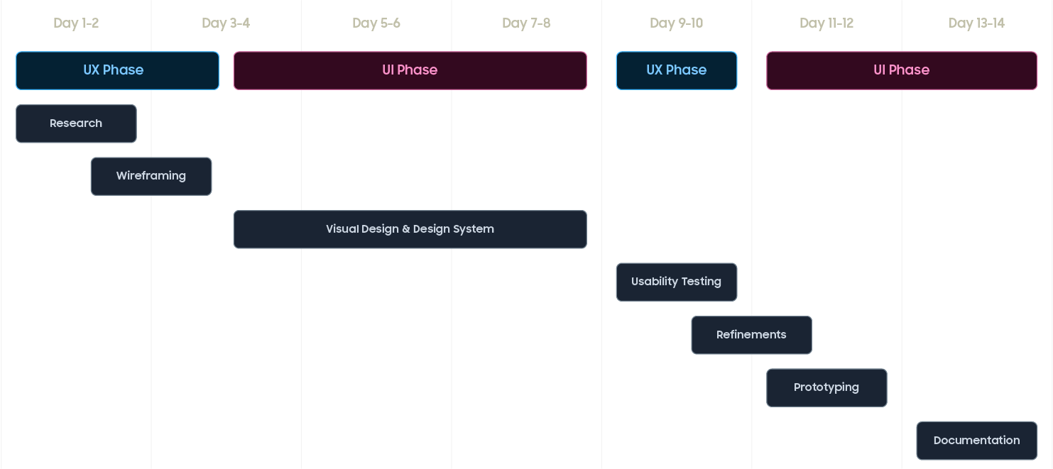
The OWVI landing page was designed over a focused 2-week timeline, following an iterative process where each phase informed the next to ensure the experience met user needs and business goals.
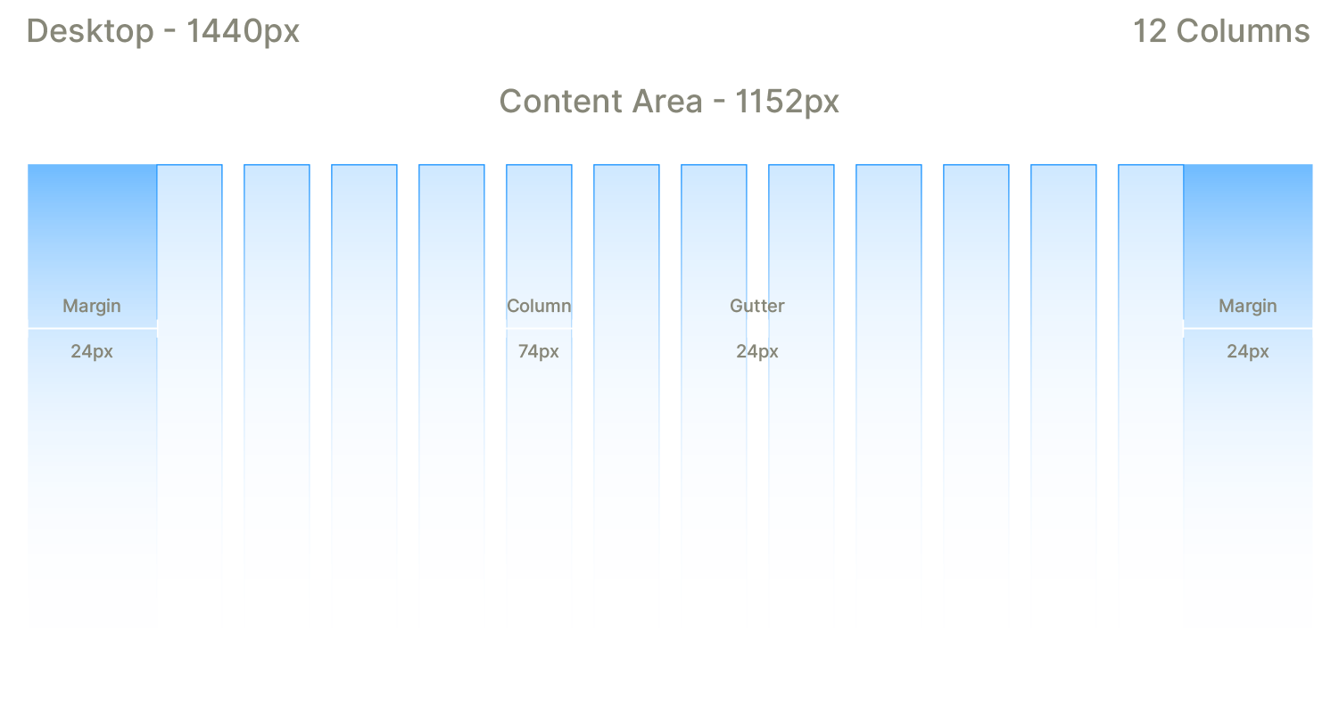
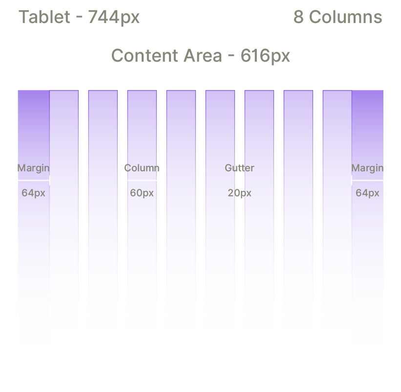
Grid System
A flexible grid system was designed to maintain visual consistency, alignment, and readability across all screen sizes. The grid ensures content adapts smoothly while preserving hierarchy and spacing in a responsive environment.

Digital Wireframes
Digital wireframes were created to outline the layout, content flow, and interaction priorities of the OWVI responsive landing page. The focus was on structuring key sections such as the hero, features, how it works, integrations, testimonials, pricing, and primary CTAs to ensure clarity, scannability, and a consistent experience across desktop, tablet, and mobile devices.
Typography
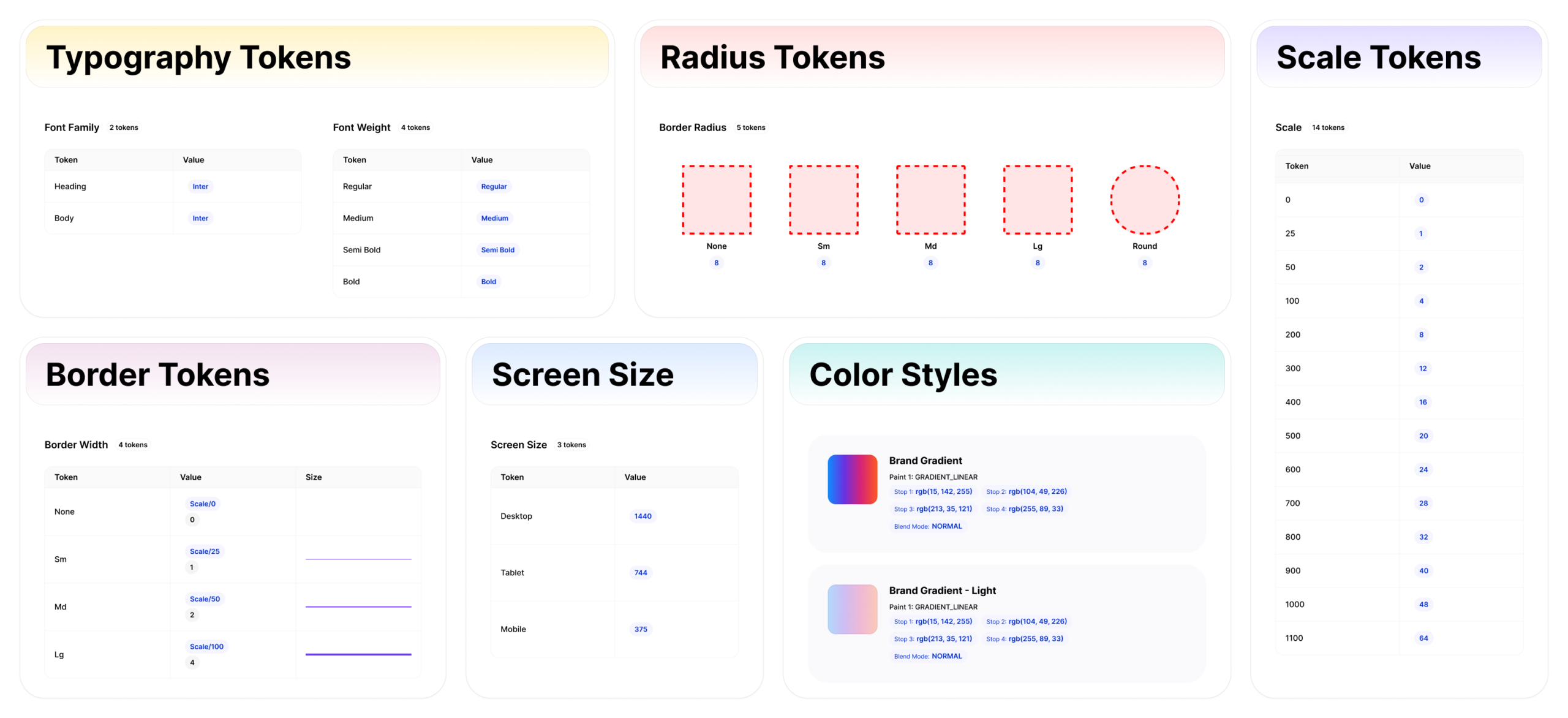
Inter was chosen as the primary typeface to ensure high readability across desktop, tablet, and mobile screens. Its clean and modern characteristics support clear information hierarchy, making it well-suited for a content-driven landing page focused on quick understanding and action.

Icons
I have used Material Symbols & Icons by Google in this project to ensure consistency, clarity, and ease of recognition. These icons were chosen for their modern aesthetic and intuitive design, helping users navigate the interface effortlessly.
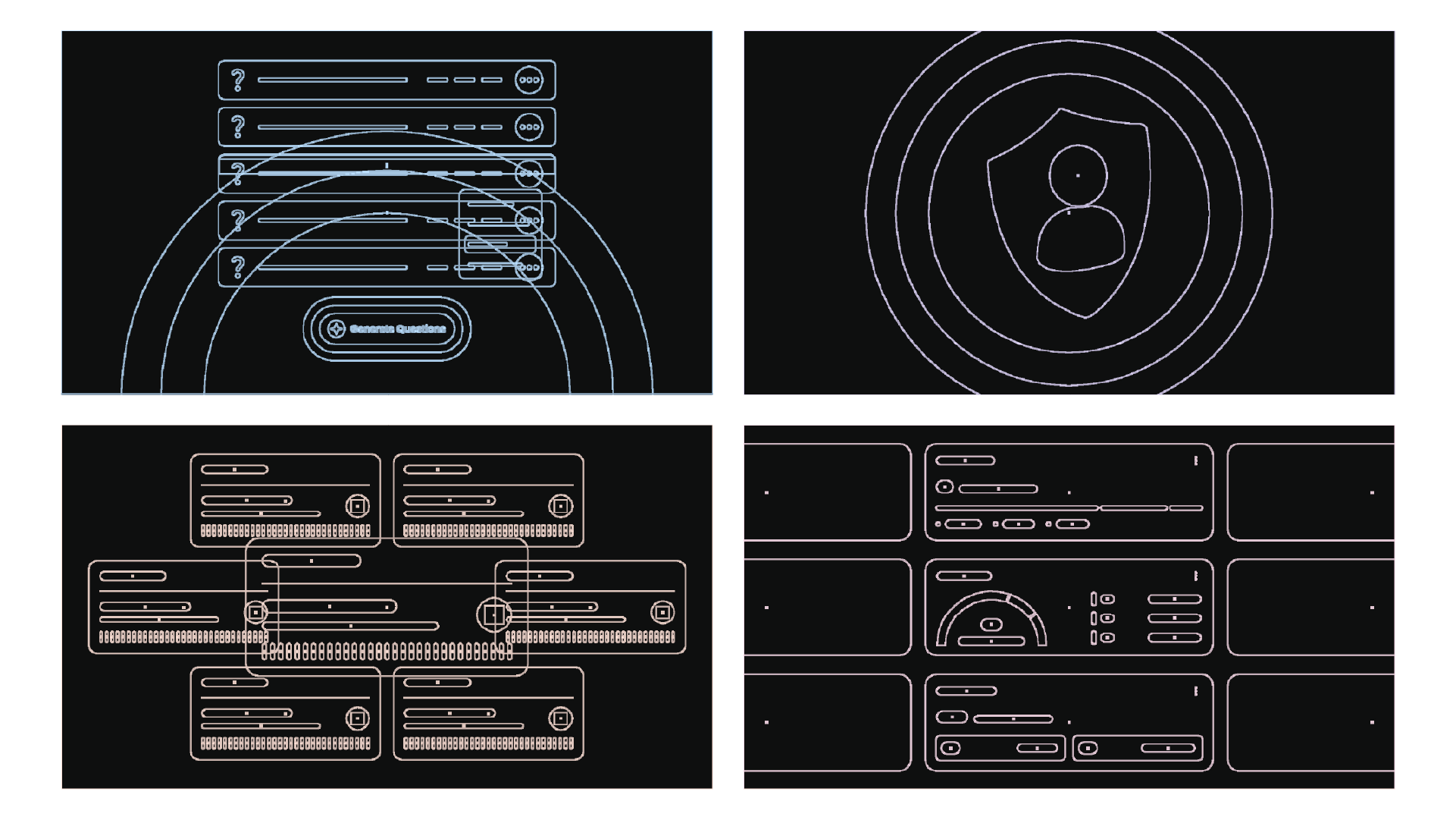
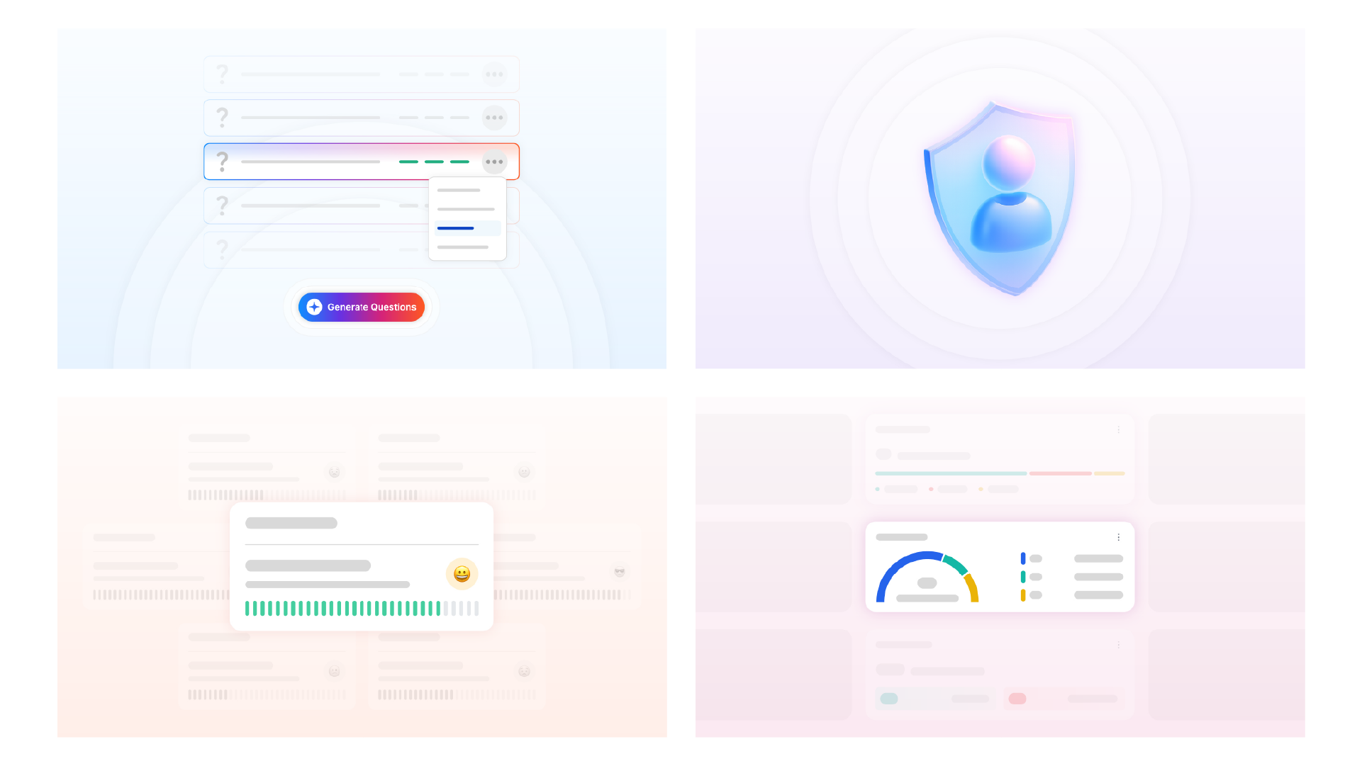
From Outline to Final Illustration
Custom illustrations were designed for OWVI using Adobe Illustrator, evolving from simple structural outlines to polished, brand-aligned visuals. This before-and-after comparison reflects the illustration workflow and attention to detail in visual execution.
Integration Flow Animation
This animation was created using Adobe After Effects to showcase how OWVI seamlessly connects with popular hiring tools across the recruitment workflow. The visual flow simplifies complex integrations, helping users quickly understand how interviews, communication, and candidate data remain unified within a single platform.
Usability Testing
To validate the effectiveness of the responsive web design, I conducted designer-led usability checks on the OWVI landing page across desktop, tablet, and mobile breakpoints. The goal was to ensure that the layout, content hierarchy, and primary call-to-action (“Try for Free”) remained clear and accessible on all screen sizes.
Using interactive prototypes, I evaluated key user scenarios such as understanding the product offering, scanning core benefits, and locating the primary CTA. Feedback was collected through observation, task walkthroughs, and interaction analysis while resizing the layout across devices.
Key Findings
🔍 Users understood the product value quickly when the hero messaging was concise and visually prominent
🔍 CTA visibility improved when contrast and spacing were adjusted, especially on mobile
🔍 Some content sections required spacing and hierarchy refinements for smoother scrolling on smaller screens
Based on these insights, iterative design refinements were applied to improve visual clarity, CTA prominence, and responsive spacing, resulting in a more consistent and user-friendly experience across all devices.
Heatmap Analysis
To further validate design decisions, I used heatmap-style interaction analysis to observe how users visually scanned and interacted with the OWVI landing page. The focus was on identifying attention-heavy areas, CTA visibility, and scroll behavior across the page.
The heatmap insights helped confirm that key sections such as the hero message, primary “Try for Free” CTA, and core benefit blocks received the highest attention, while lower-engagement areas informed spacing and content refinements.


Responsive Design Across Devices
The OWVI landing page was designed with a mobile-first mindset and scaled seamlessly across desktop, tablet, and mobile breakpoints. Each layout maintains consistent visual hierarchy, readable typography, and clear calls-to-action, ensuring an intuitive experience regardless of screen size.
Desktop - 1440px

Tablet - 744px

Mobile - 375px

Responsive Web Design In Action
A real-time view of the OWVI landing page adapting seamlessly from desktop to tablet to mobile while preserving structure, readability, and interaction priorities.
To solve challenges like time-intensive screening and unclear product value, I designed a responsive landing experience for OWVI that highlights the benefits of one-way video interviews. The solution improves content clarity, CTA visibility, and cross-device usability, resulting in a focused, conversion-ready experience.
Thank you for viewing my OWVI Resposive Website Design Case Study.
