
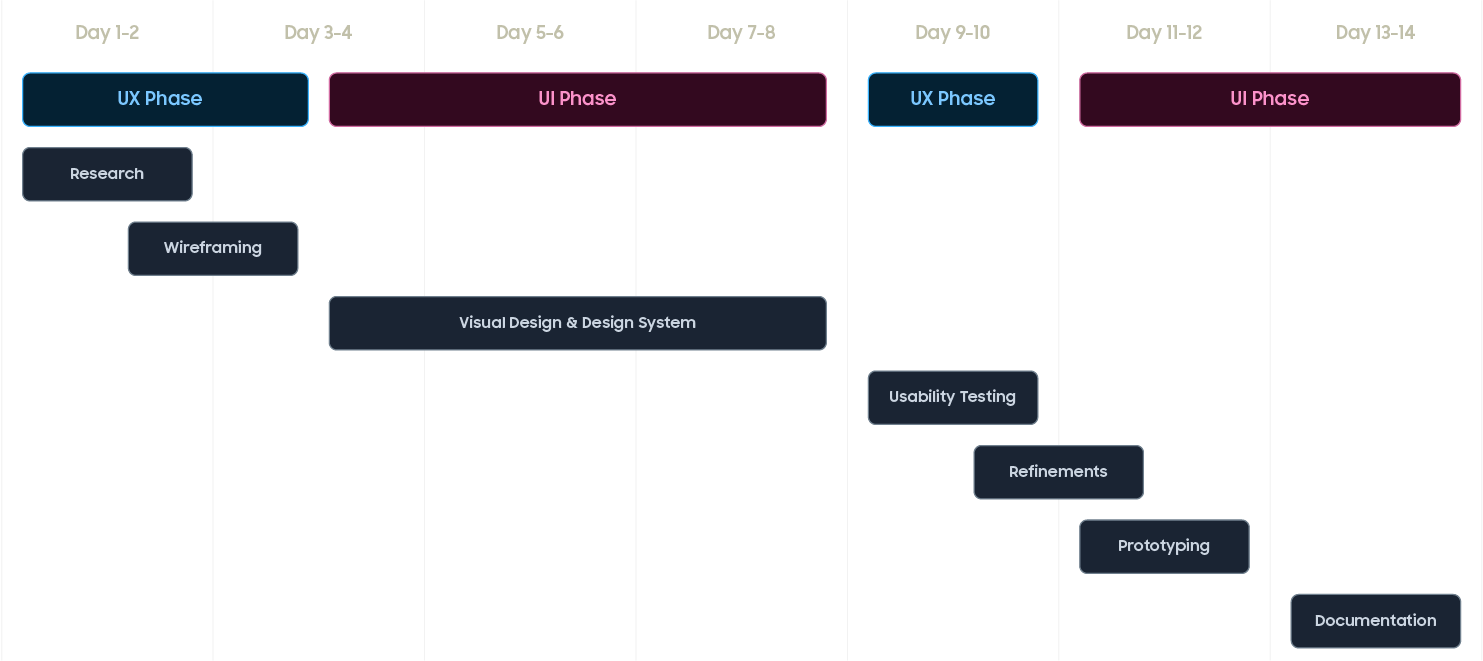
Research

Wireframe

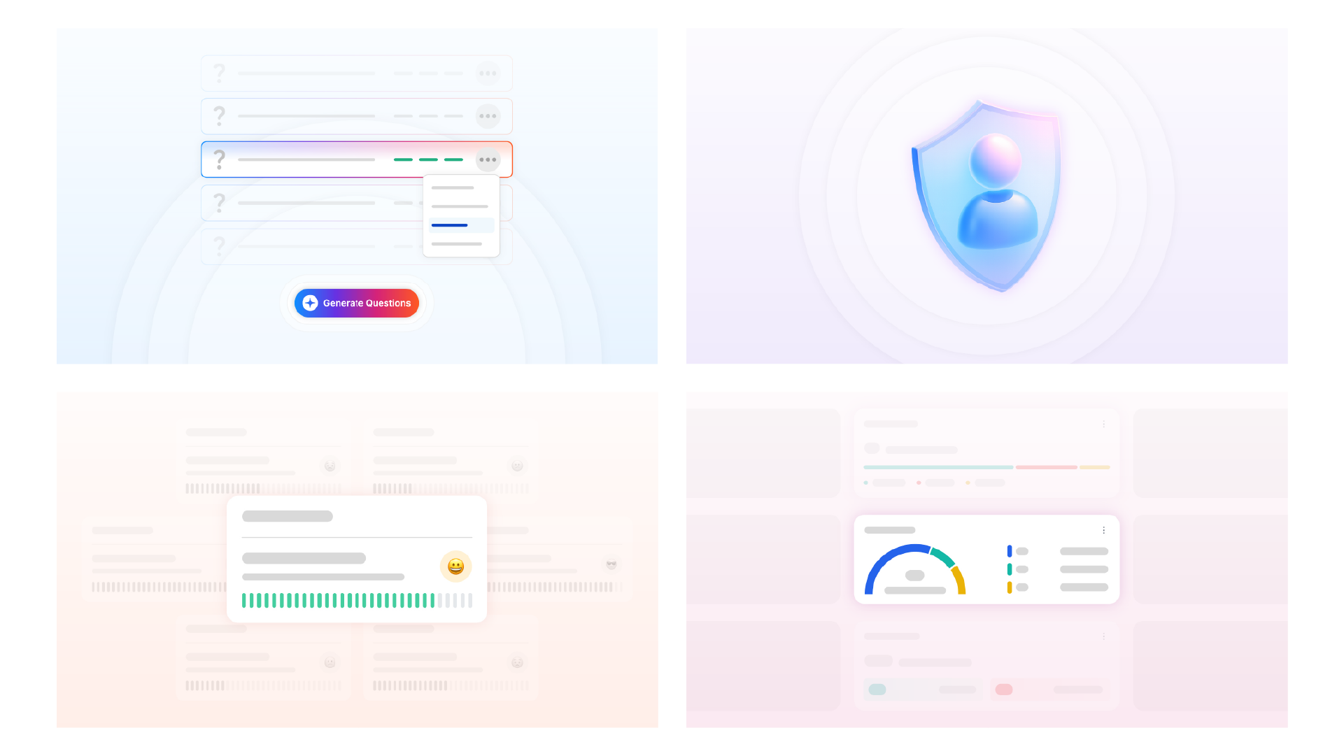
Visual Design

Prototyping

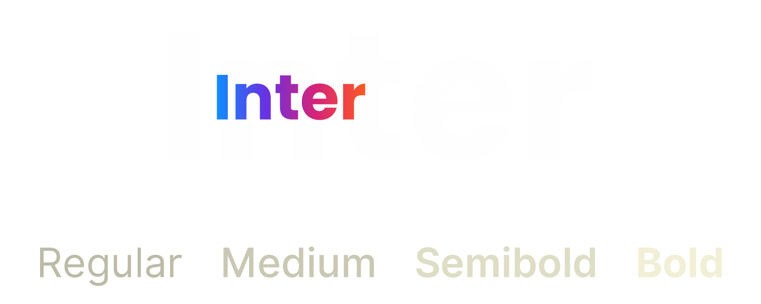
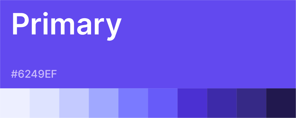
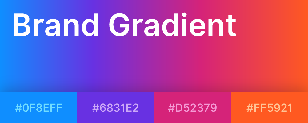
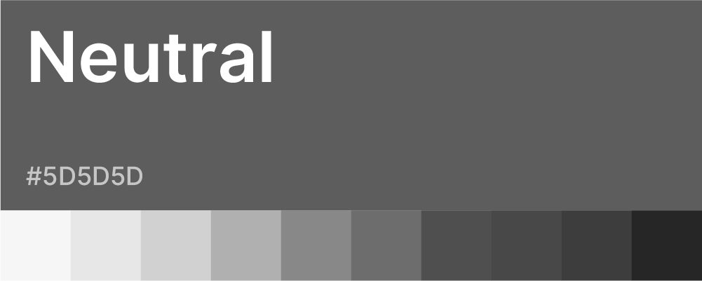
Design System

Documentation


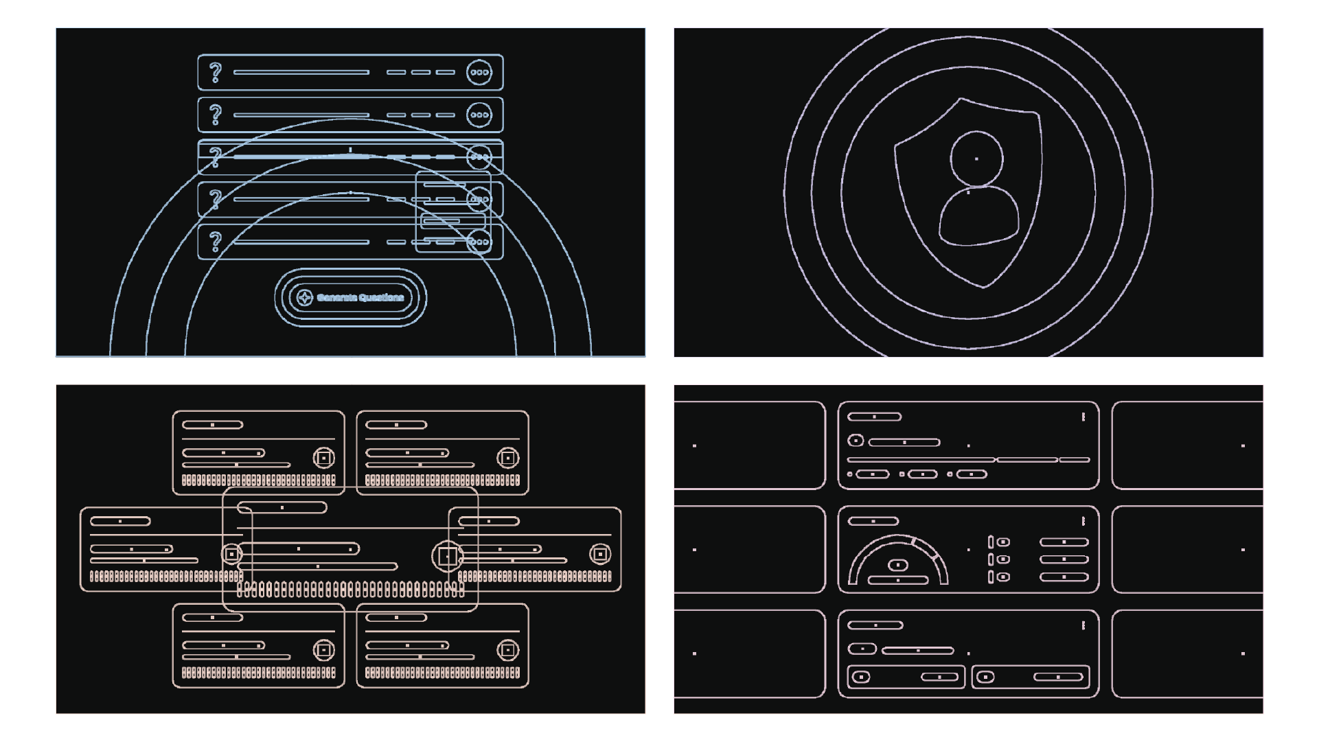
Outline
Before